It can be very tempting to load up your online store with features and branding and special offers and…all of a sudden your website is metaphorically shouting at your customers. Great eCommerce web design is about giving your customers what they want without overwhelming them with unnecessary options and information.
Minimalist doesn’t mean boring
The idea of minimalism can evoke images of all-white everything, lots of empty space and stark contrast. This certainly is part of it! However clean and simple web design doesn’t have to be dull.
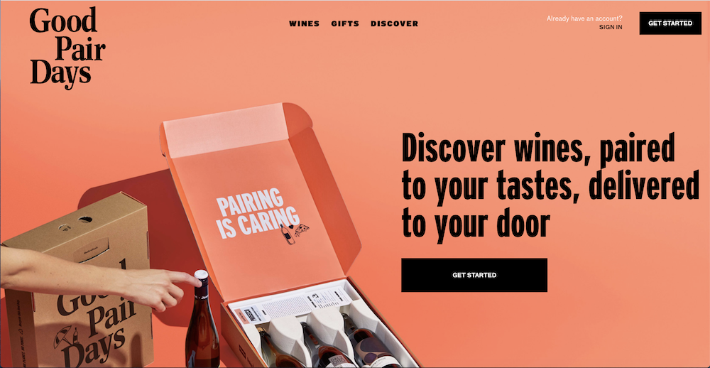
Good Pair Days, a personalised wine delivery service, embraces minimalist web design while also fully committing to their bright tangerine branding. Their homepage is incredibly bright and eye-catching. Simultaneously, it is trimmed down to just the essentials. Customers know exactly where to click.
Let your products take centre stage
One of the key components of all good web design is fantastic product photography. This is even more crucial with minimalist design.
Create a feeling of luxury
Luxury skincare brand Aesop is well known for its understated high-end store design. This feeling is continued on its website and bolstered by flawless product photography.
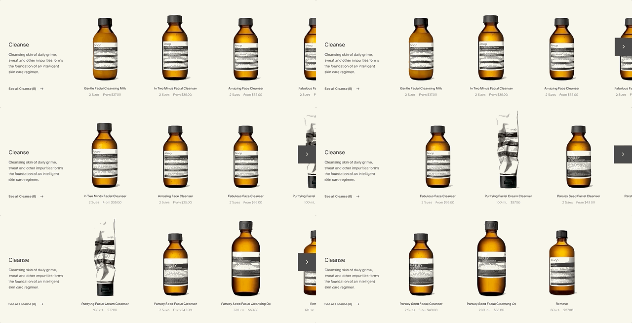
Each simple brown glass bottle is perfectly photographed and presented without distraction, keeping the focus on the product.
Show your customers what they want
Counterintuitively, good minimalist web design can help you share more information with your customers. It’s all about careful consideration of what your customers want to know and when they want to know it. A pared-back design can also keep your customers focused on finding the product they want and making a purchase.
Allbirds—Information at the right time
Environmentally-friendly footwear company Allbirds has deceptively simple product pages. A customer is shown pictures of each shoe, along with the name and price. It’s only when a potential customer mouses over a particular product that more information is displayed. This shows the available sizes and a quick add to cart option.
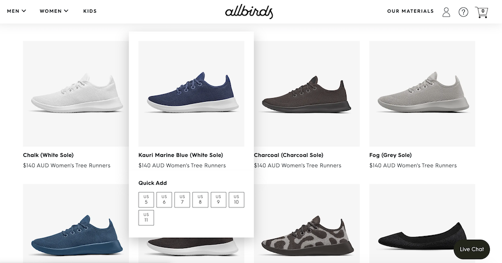
this interactivity has the added benefit of clearly showing that the item is clickable. All this without visually overwhelming their customers!
Tinker—displaying ALL the options
Online watch company Tinker lets customers choose from a large number of face sizes, casing finishes and strap colours. That’s a lot of options! To keep this all of this information digestible and user-friendly, they have used a simple filter at the top of the product page.
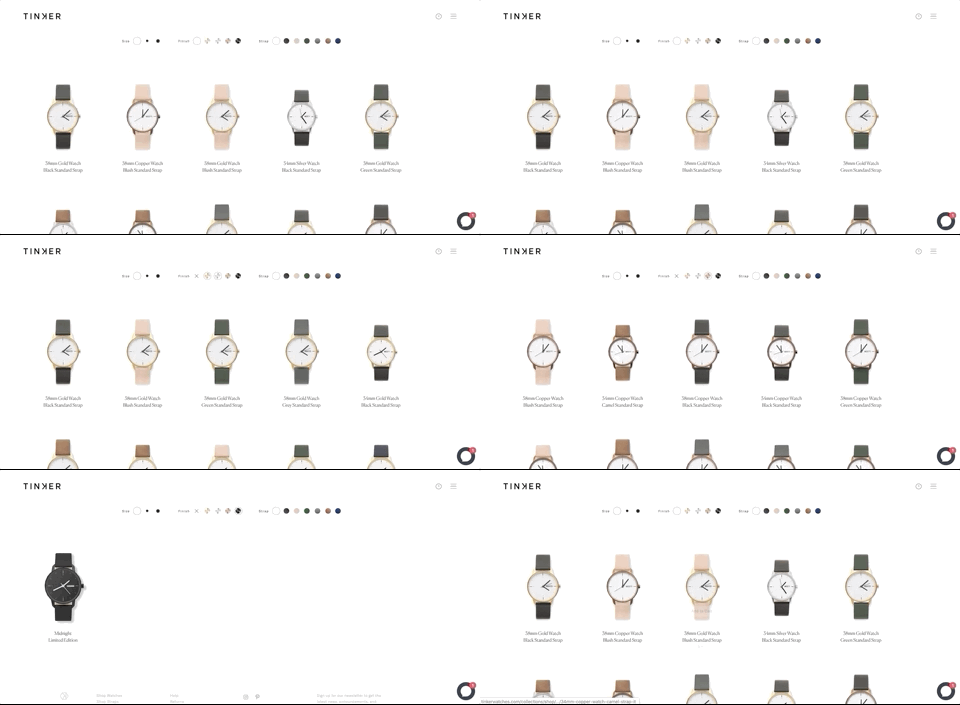
Finding the perfect watch is much easier without distractions. This is a great way to sort a large number of products without losing functionality.
Go beyond your website
The design of your eCommerce site should be just one part of your overall visual branding. A cohesive brand experience should extend to all interactions you have with your customers and potential customers.
As mentioned above, wine delivery service Good Pair Days manages to expertly combine minimalism and bright fun colours on their website. Unsurprisingly, this extends to their social media and emails.
Simple tweaks can go a long way towards creating a coherent brand that people want to interact with. Be consistent with:
- Font
- Colour palette
- Excellent photos
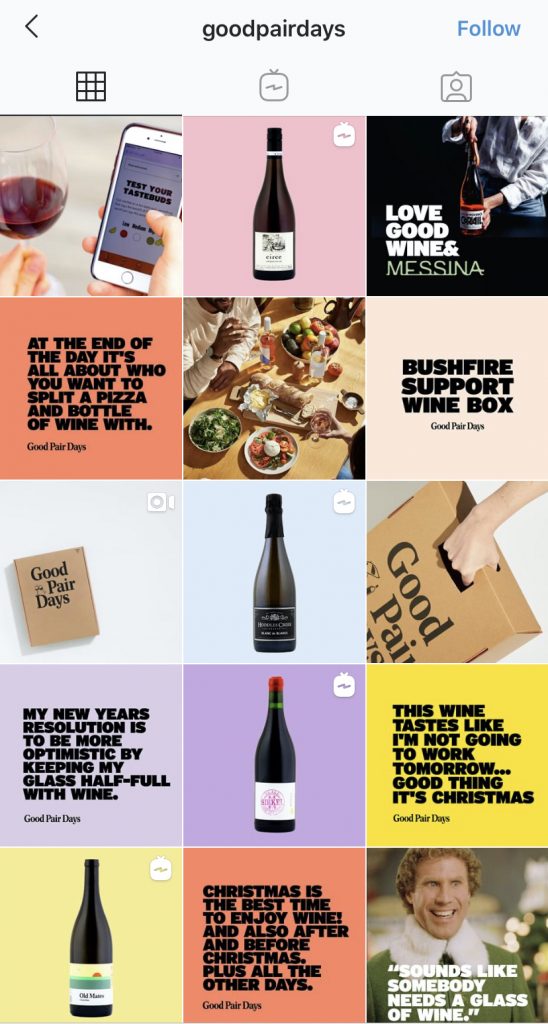
When it comes to email, the same rules apply. Most people receive so many emails that you really need to get your message across as quickly and clearly as possible.
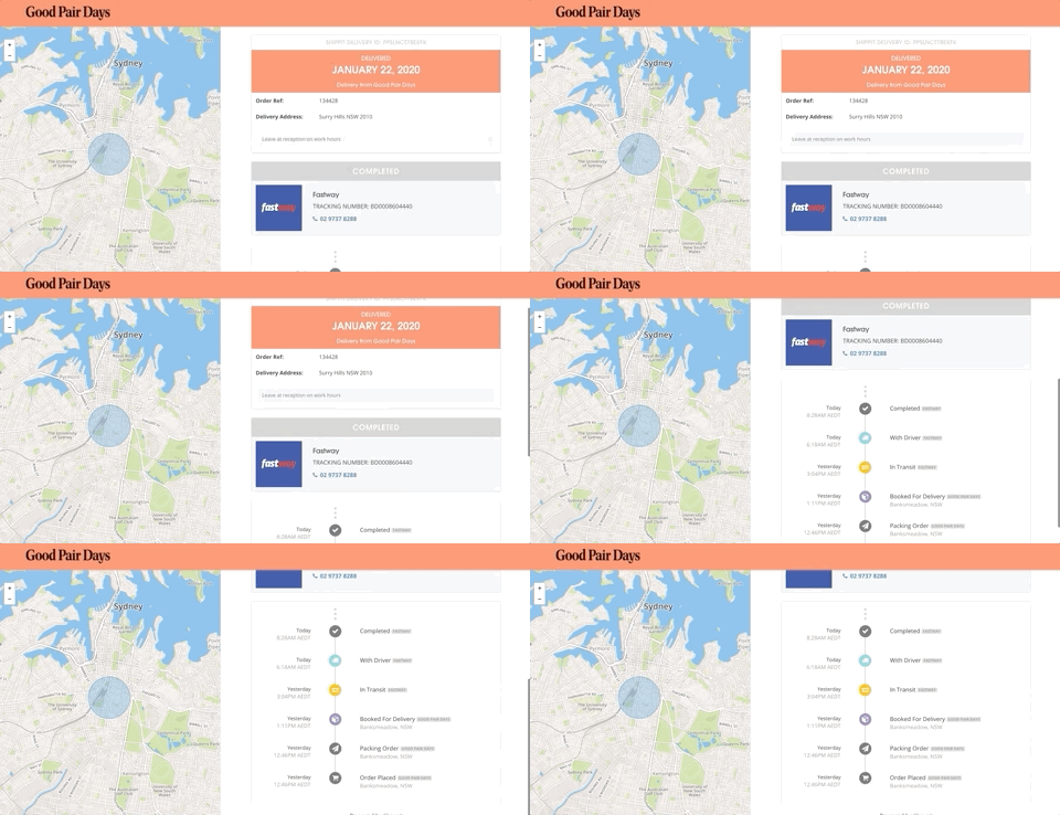
Good Pair Days excels here too. Using Shippit allows them to send their customers branded tracking notifications, creating a seamless brand experience.
Now that you’ve got your eCommerce website design sorted, prepare your business for the upcoming demand with our eCommerce Calendar cheat sheet.
